Identity
The family business InterEast needed a new visual identity that better reflected the company’s culture and values–shaped by a strong environmental policy and a firm commitment to equality.
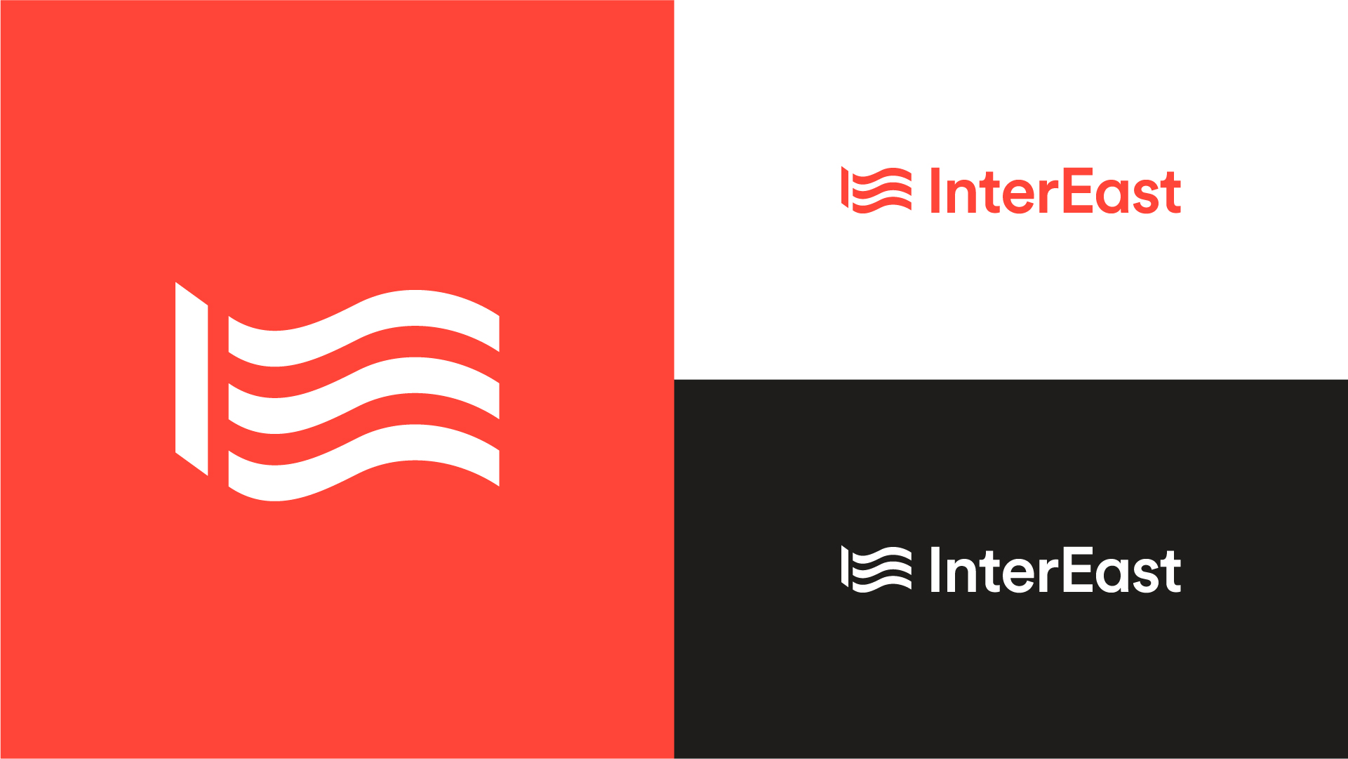
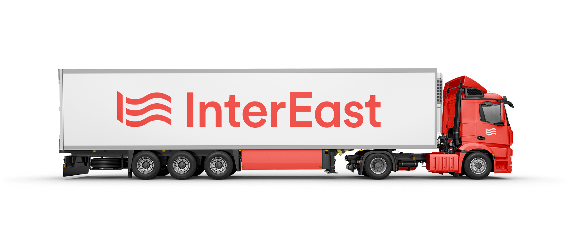
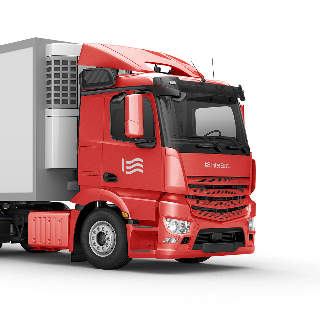
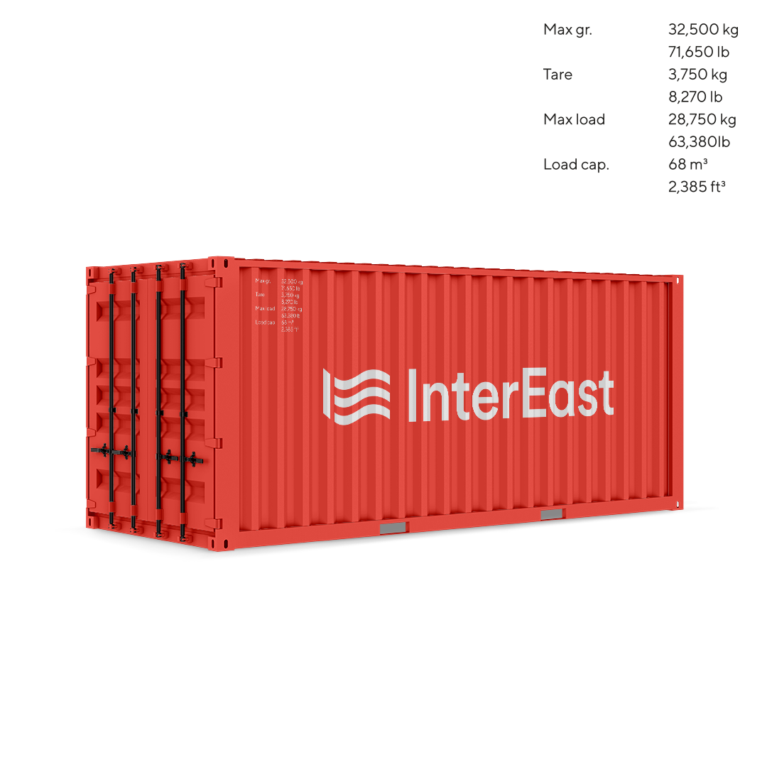
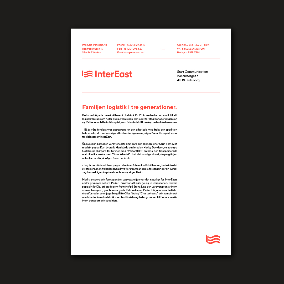
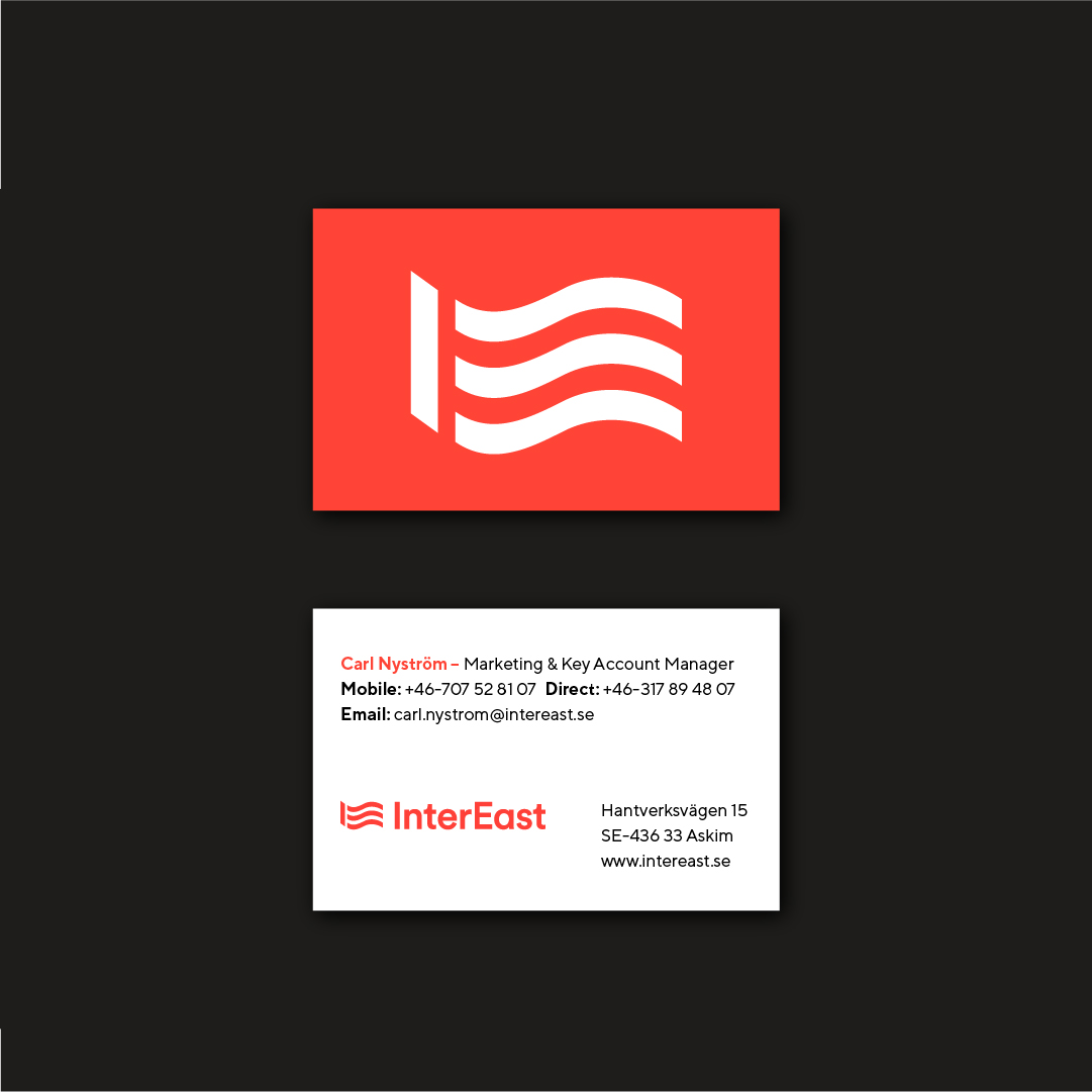
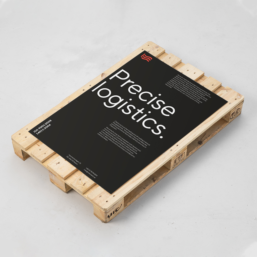
The new identity is built around a symbol inspired by the company’s initials, designed in the shape of a flag, symbolizing pride and unity within the organization. This distinctive design reinforces the company’s values and ambitions, while visually reflecting its foundational principles. To complement this, we integrated modern and welcoming typography and updated the existing color palette to preserve brand recognition while creating a more contemporary look.


Proud Member of More Alliance
